
Kube Print
Branding – October 2015
Duties:
Research
Brand Strategy
Art Direction
Graphic Design
Artworking
Reliable print
An acquaintance through Bromley Rugby Football Club and Managing Director of Kube Print, Adam Frost asked if I could help revitalise Kube with a new brand.
Solid, reliable
It was clear the previous identity wasn't working as hard as it could be, so our first steps were to deconstruct the brand and find out what Kube represented. We concluded that 'Kube' represented something solid and reliable and this became the foundation for the rest of the brand.
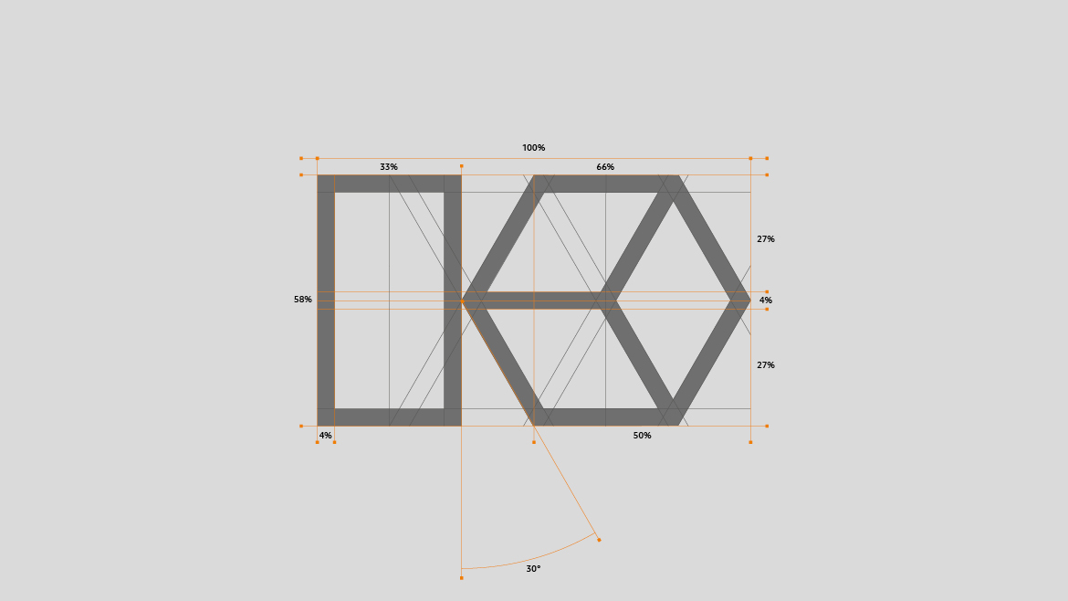
We wanted the identity to reflect the name, eluding to something strong, sturdy and structured.
We wanted the identity to reflect the name, eluding to something strong, sturdy and structured.


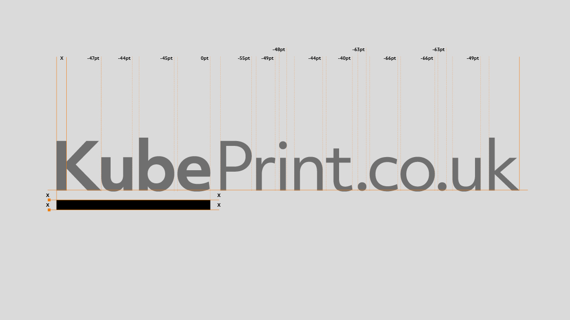
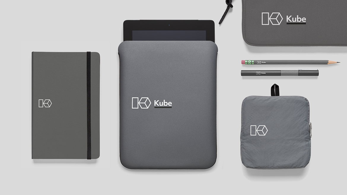
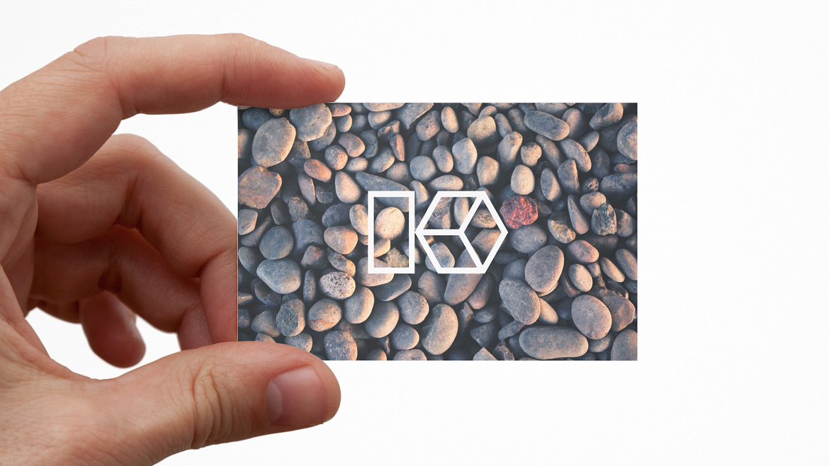
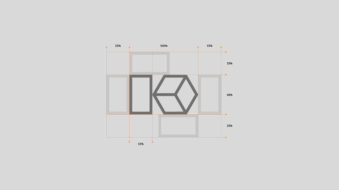
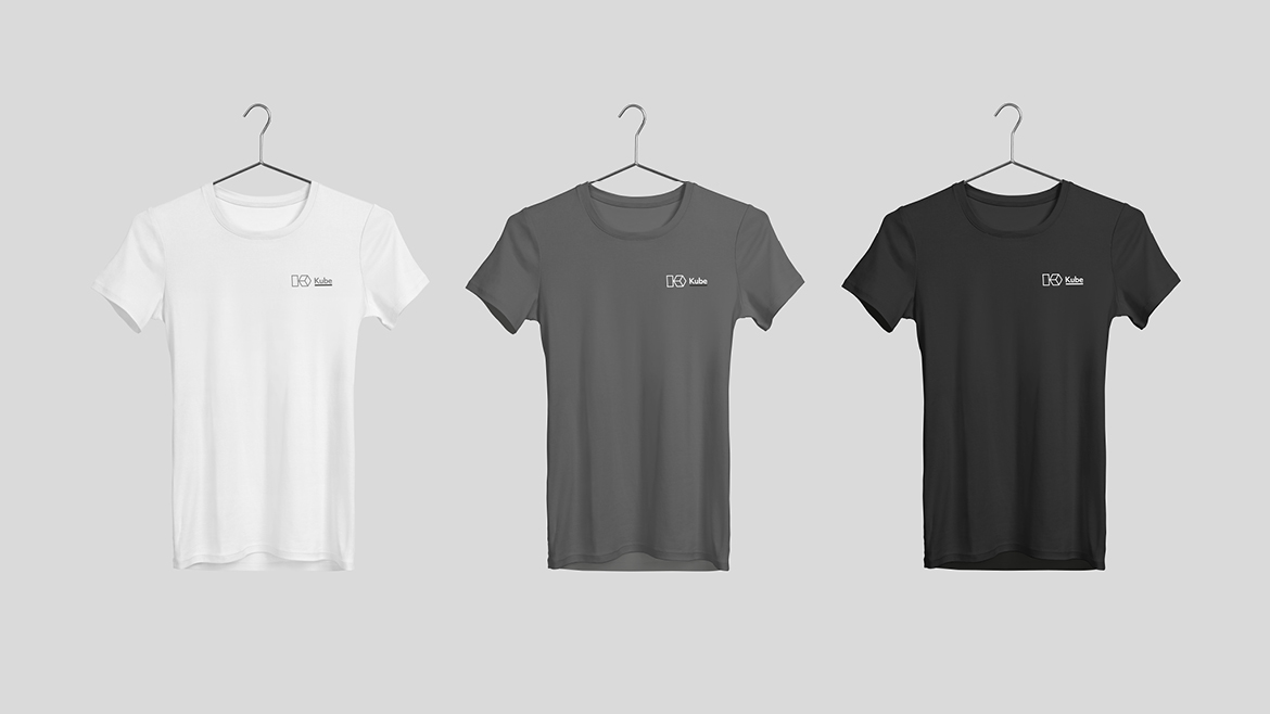
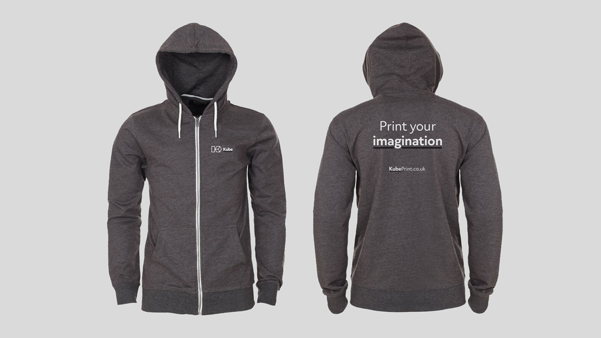
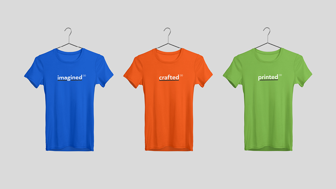
The simplicity of the identity meant that when it was applied, it gave us some flexibility to be creative.
The simplicity of the identity meant that when it was applied, it gave us some flexibility to be creative.

© Wrightio Ltd Lewis@wrightio.com